

Your website is one of the *best* ways to promote your language teaching business without constantly having to create content.
But like any marketing channel, it takes a bit of planning to get right.
If your website’s getting plenty of visitors but few conversions, it’s time to troubleshoot.
Here are 5 mistakes language teachers often make on their websites (and how to fix them, obvs).
#1 Prioritising design over copy
Design and copy are like subjects and verb conjugations — one just doesn’t work without the other.
And yet, wayyy too many business owners prioritise how their website looks over what it says.
If you can afford to spend time (and/or money) on perfecting both the copy and design, you won’t regret it. But if you *have* to choose one over the other? Make it your messaging.
Because a pretty website might make you happy.
But the right words might make you rich.
#2 Welcoming people to your website
Your website has less than 15 seconds to catch attention. Don’t waste them on trying to be polite.
Instead, use the headline and description spaces to tell your visitors exactly what you do.
If you’ve done your market research, your words should make your visitors feel welcome by saying exactly what they want to read.
#3 Listing your qualifications like a CV
Fun fact: we buy things based on how they make us feel, and use logic to justify the purchase.
That’s why we talk about highlighting the benefits of an offer over its features. The benefits spark the reader’s imagination and make them want the product.
Your credentials are authority signals that help rationalise someone’s decision to buy your course. But they’re not what keeps your offer on their mind.
So instead of leading with what makes you qualified, start with what you can do for the reader. This creates an emotional connection that increases the chances they’ll buy.
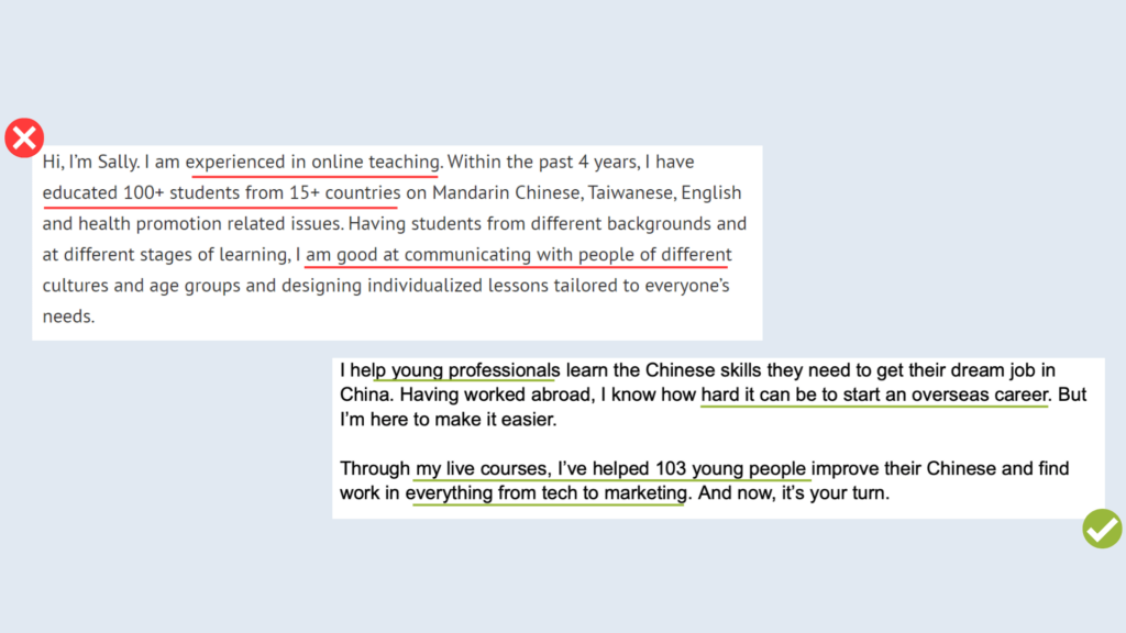
For example:
#4 Creating a ‘why choose us’ page
Newsflash: the whole purpose of your website is to convince someone to choose you.
So if you’ve written your copy strategically, you shouldn’t need this page.
Instead, list the most compelling reasons why someone should choose you and sprinkle them across your entire site using stories, testimonials, results and your wonderful personality.
This way, you can make sure everyone who visits knows exactly ‘why you’.
#5 Adding testimonials to one page
Social proof is one of the most powerful tools of persuasion you can use.
Seeing how other people have benefited from a product or service makes us more likely to trust the brand. It also answers our questions and helps us visualise our future selves.
In other words, reviews are too important to be confined to a single page. Place them strategically throughout your entire website to consistently remind readers why you’re the right choice.
Are you making any of these mistakes with your website copy?
If so, let’s fix them. Join my free webinar on 28th February, 2024 to learn how to avoid the biggest website mistakes and write copy that converts more students.
Oh, and if you sign up, you’ll also get the chance to apply for a free web copy review.
February 23, 2024


did you enjoy this post? Share it!